How to Photograph Analog Illustrations and Paintings | A Basic Guide to Beautiful Shooting and Editing with Your Smartphone
Published date:
2026-05-19
Opportunities to photograph hand-drawn illustrations and paintings are surprisingly common, whether for posting on social media or submitting artwork for gallery and exhibition applications.
In such cases, many people struggle because their photos don't capture the charm of their work, often appearing "darker than the original," "with different colors," or "looking somewhat messy."
This article summarizes the basics, from how to beautifully photograph your artwork with a smartphone to how to edit the photos you've taken. Even without special equipment, simply understanding these key points can significantly improve the quality!
Even with a smartphone camera, you can faithfully capture the colors and textures of your artwork if you know the right techniques. Here, we'll introduce the basics for beautifully photographing analog artwork.
To photograph your artwork beautifully, the lighting environment is crucial.
If you don't have special lighting equipment to create uniform light, we recommend photographing in a bright location with natural daylight.
Light that doesn't cast strong shadows, like on a bright overcast day, makes it easier to naturally capture the colors and textures of your artwork.
In direct sunlight or brightly lit areas, the contrast can become too strong, or the colors might appear different from the original, so caution is advised.
Also, avoid using flash.
Using flash can easily overexpose the image (cause "whiteout"), and the delicate colors and brushstrokes of the painting may be lost.
If light is too concentrated on one spot, it can cause glare and unevenness, so the key is to aim for soft, diffused lighting.
Try to find a spot, such as near a window, where soft light falls evenly across the entire artwork, and photograph it where it looks best.
If you can't get enough natural light indoors, using supplementary lighting like a ring light is one option.
The key here is not to shine the light directly onto the artwork, but to soften and diffuse it by bouncing it off a wall or ceiling, or by placing a white cloth or tracing paper in front of it. Adjust the position so that light falls evenly across the entire artwork, and try to minimize strong shadows. (If you want to set up a more professional environment, you can also place a translucent umbrella in front of the light.)

The basic rule for photographing artwork is to shoot straight on from the front, not from above or below.
Taking a photo at an angle can cause distortion that differs from the actual object, altering the impression of your work.
When shooting with a smartphone, even a slight tilt can become very noticeable on the screen.
Make sure to align your camera with the center of your artwork, keeping it at the same height.
It's also helpful to turn on your camera's grid lines.
Aligning the vertical and horizontal lines of your artwork with the grid makes it easier to prevent tilting.

Make sure to photograph your artwork from an optimal distance – not too far, not too close.
If you're too close, the perspective distortion will be pronounced, but if you're too far, fine details will be hard to distinguish.
A good approach is to start by shooting from a slightly further distance and then find the range where distortion is minimized.
Gradually move closer and find the absolute closest distance where the artwork's details appear clearest.
Smartphones, in particular, tend to produce distortion when photos are taken from too close a distance.
If you anticipate distortion, one strategy is to shoot from a bit further away and then crop the image later.
When photographing traditional art, illustrations, or paintings, if you place the artwork on a table or floor and shoot from directly above, the photographer's shadow will almost certainly appear in the shot.
Therefore, it's best not to lay the artwork flat. Instead, try leaning it against something, hanging it, or holding it. If you lean it, you can also use an easel or a smartphone stand to keep it steady.
Standing the artwork upright allows light to fall more evenly and helps prevent unwanted shadows from appearing in the shot.

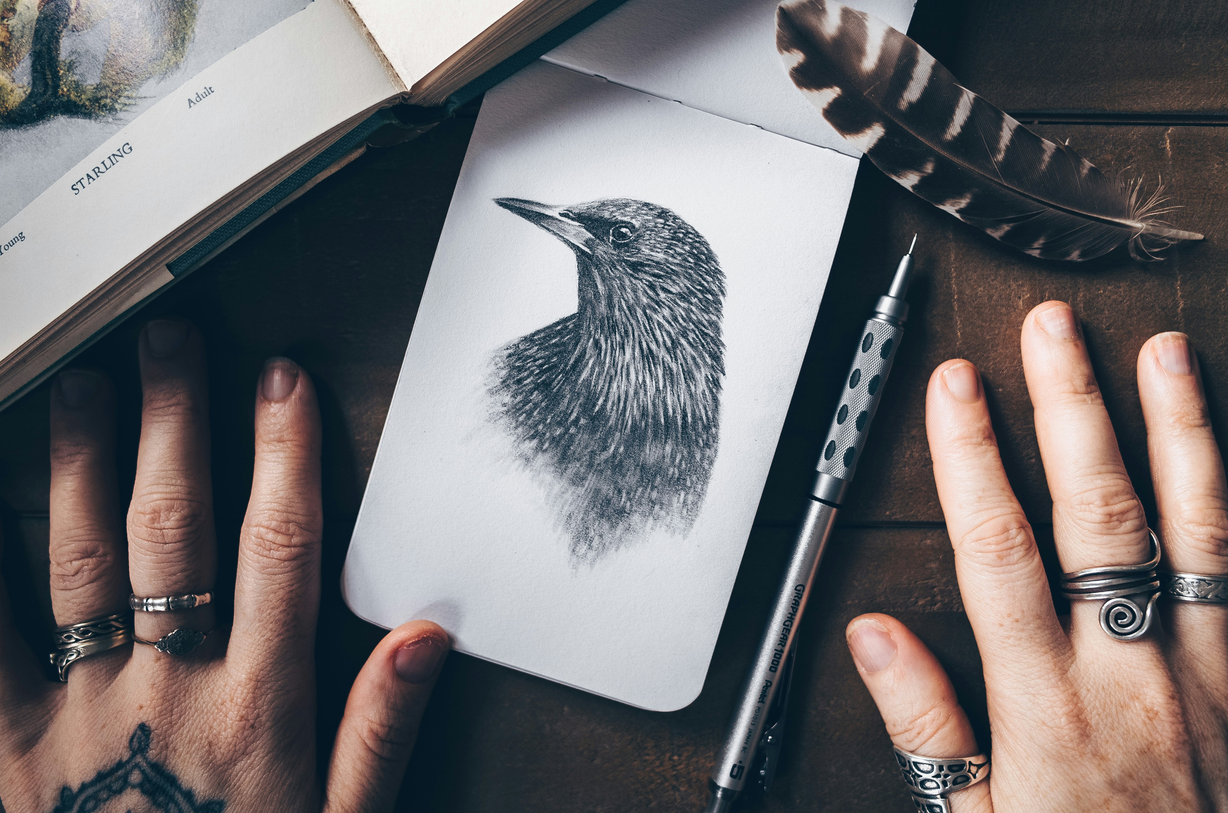
It's perfectly fine to hold them in your hand while photographing.
Assuming you'll crop it later, it's okay if extra elements like hands or background appear in the shot.
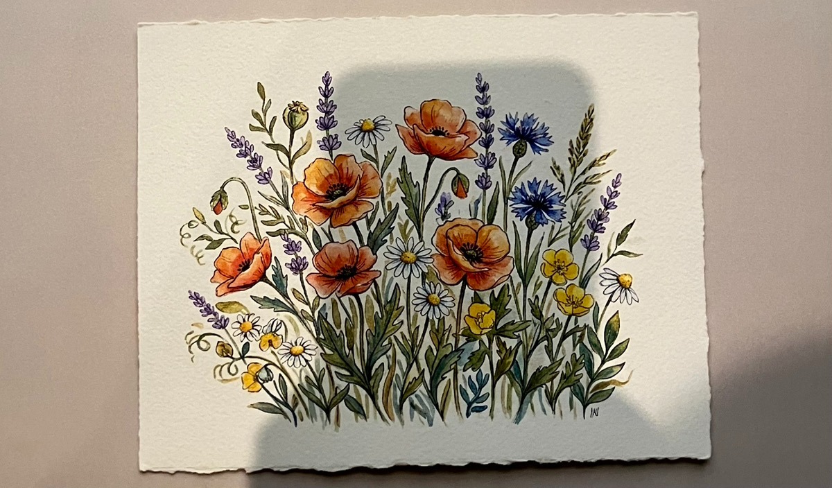
For artworks on sketchbooks or thick paper, it's recommended to lean them against a wall or board for photography.
This makes it easier to shoot straight on and ensures the light hits the entire artwork evenly.
When photographing thin paper like copy paper, lightly securing it to a white piece of thick paper or board before shooting can prevent the paper from warping or casting shadows.
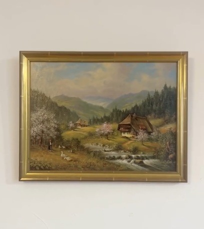
For artworks on canvas or panel, hanging them on a wall for photography is the basic approach.
If you photograph them lying flat, not only are shadows more likely to appear, but the angle can also make them look distorted.
If the artwork is framed, be careful of light reflections on the glass surface. If the camera or indoor lighting reflects off the glass, the artwork can become difficult to see. The easiest solution is to remove the glass just for the photo shoot.

Instead of photographing with a smartphone, you can also scan the artwork.
Scanners have the advantage of stable colors regardless of the shooting environment, making them suitable for artworks drawn flat on paper, such as the following:
On the other hand, smartphone photography is more suitable than a scanner for the following types of works:
Household scanners tend to produce shadows if the paper isn't flat, making them unsuitable for textured paper like watercolor paper or drawing paper.
That's why CCD scanners are recommended. While CCD scanners for home use are often expensive,multi-function copiers at convenience stores like FamilyMart and Lawson often use CCD sensors,and can be easily used.
Example Convenience Store Scanner Settings (as of April 2026, for FamilyMart)
Note that after scanning, thin linear noise may appear due to dust on the glass surface or other factors. In such cases, repair is necessary using an app's eraser function or software like Photoshop.
Even if you take a good photo of your artwork, it's common for it to appear darker than the original, for the paper color to look yellowish, or for it to be slightly tilted. In such cases, you can make adjustments using just your smartphone's standard apps.
A good first step is to straighten and crop your image.
When photographing artwork with your smartphone, desks, backgrounds, fingers, and shadows tend to appear in the shot. First, crop these out and adjust the photo so that only the artwork is visible.
Key Points
If the angle is even slightly off during shooting, the artwork will appear distorted. Adjust this along with cropping.
Key Points
Smartphone photo apps come standard with editing features that allow for detailed adjustments.
For iPhones, open the photo you want to edit in the Photos app, then tap the adjustment icon at the bottom of the screen to access various settings.
For Android, adjustments can be made from "Edit" in Google Photos.
Here, we've compiled recommended settings for processing your image to closely resemble the original, presented in a video and a table. First, try adjusting the following items little by little to match the atmosphere of your artwork.
While your smartphone's native app can handle basic adjustments, for more detailed refinement, we recommend using free apps like "ibisPaint."
By simply mastering the basics of photographing, scanning, and editing photos of your analog illustrations and paintings, you'll be able to convey the true charm of your original works much more accurately. While it might seem like many steps at first, it's not difficult once you get the hang of it.
Mastering how to photograph your artwork will be invaluable not only for domestic open calls and exhibitions but also when applying to or exhibiting at international art fairs.
We at Japan Promotion have supported over 6,600 overseas exhibitions and participations to date. If you are interested in art activities abroad,inquiriesare welcome.
Related Articles:How to Tie a Picture Frame Cord: Safe Hanging Methods and Cord Materials for Paintings